


Color Contrast in Web Accessibility: The Audience’s Choice Color!
Boosted Build
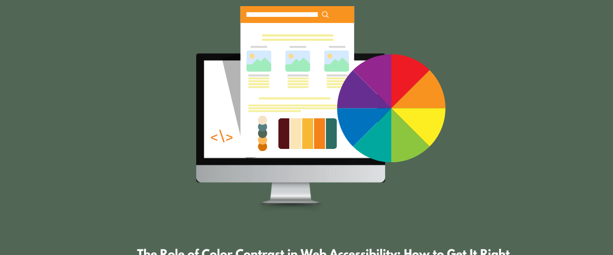
The Role of Color Contrast in Web Accessibility
In the online era, developing a comprehensive online interaction is crucial for reaching out to all users, including those with sight disability. One of the most primary aspects of web accessibility is color contrast. This blog will examine the role of color contrast in web accessibility and interactivity with users and offer actionable tips to confirm your website meets the required standards.
Understanding Color Contrast
Color contrast describes the difference in brightness or color that makes an object recognisable from its background. For website accessibility, it’s essential to understand what would be the background & what would be the front design color. Alignment of color contrast with your brand & your site not only enhance readability but also ensure that disabled people also understand & engage with their content.
Why Color Contrast is Important?
- Improve Readability: Color contrast enhance readability that increase the chances of audience engagement.
- Helps Users with sight Impairments: Approximately 285 million people all over the world have blindness, including color blindness. High contrast helps these users interact with web content more efficiently.
- Fulfills Accessibility Standards: Following color contrast guidelines ensures adherence with WCAG, which are necessary for preventing legal consequences and promoting openness.
Color Contrast Guidelines
The WCAG outlines particular contrast ratios that should be followed:
- Regular Text: A minimum contrast ratio of 4.5:1 against its background.
- Large Text: A minimum contrast ratio of 3:1 for text prominent than 18pt or 14pt bold.
- Graphical Objects: Any graphical elements (like buttons and icons) must also meet the same contrast criteria.
How to Get Color Contrast Right
Here are practical actions to ensure your website preserve proper color contrast:
1. Choose the Right Color Palette
- Decide on a color palette that includes a variety of colors, ensuring you have adequate contrast. Resources like Adobe Color and Coolors can help you develop navigable color combinations.
2. Employ Contrast Checking Tools
- Make use of online tools such as:
- WebAIM’s Color Contrast Checker: The tool that’s helpful for you to analyze your color proportions
- Contrast Checker by Accessible Colors: This tools examine your color contrast according to WCAG guidelines.
3. Test with Actual Users
- Include users with visual impairments in the testing phase. Their responses will provide understanding into how well your color blends work in practice.
4. Avoid Color-Only Indicators
- Do not depend on color to communicate information. For example, in graphs and charts, employ patterns or tags in addition to color to make sure everyone can understand the content.
5. Evaluate Color Blindness
- Roughly 1 in 12 males and 1 in 200 females are color blind. Employ color blindness testers like Color Oracle to check how your color choices look to those with color vision deficiencies.

Practical Examples:
To give you a clearer insights, here are some examples of efficient color contrast:
- Impactful Contrast: Deep blue text on a white background (Contrast Scale: 7:1)
- Bad Contrast: Having bad contrast means very light colored text on light background (Contrast Scale: 1.5:1).
Conclusion
While you want attractive brand’s images or you want to entice audience to your site, you just need to focus on your site’s visibility and enhance the color contrast that you used. Color contrast not only the colors that you like they should be remindable & accessible too.
Is your website accessible? Take action today by assessing your current color contrast and making necessary adjustments. For professional assistance in enhancing your website’s accessibility, contact us today!