


Responsive Logo Design-The Necessity
Boosted Build
Responsive Logo Design: Why It Matters and How to Get It Right
An adaptive and responsive brand identity can be created where every element is being carefully crafted, drafted and designed. And one of the small but main elements is responsive logo design. Mostly, a logo is all about the first impression impacting customer’s behavior. So design it according to your product’s width or height.
So, in this blog we’re going to discuss “What’s a Responsive Logo Design?” or “How a non-responsive logo can make a bad impact on your site?” and can affect reliability.
Why Does Responsive Logo Design Matter?
The way how we interact with digital content, now-a-days has been revolutionized. The logo is a visual identity that helps to identify your brand in the rush of digital content.
For instance, a logo might be good on a desktop screen but it is distorted when viewed on a mobile or tablet screen—displayed with low quality or distorted image.
And for this reason we use a responsive logo—that’s adaptable to screen sizes, appears with high quality and gives a clean view.
Key Principles of Responsive Logo Design
1. Simplify Your Logo Elements
Start by analyzing your logo’s design elements. Logos that rely on intricate details or too much text can become hard to recognize on smaller screens. Simplifying the design can help maintain clarity and legibility across all device sizes.
- Typography: Consider using larger, simpler fonts or limiting the use of decorative fonts that may lose readability on smaller devices.
- Iconography: If your logo includes a detailed symbol, test it on different screen sizes. You may need to create a simplified version for mobile screens, or even a standalone icon that can be used as a shorthand for your brand.
2. Use Scalable Vector Graphics (SVG)
Responsive means scalable, having such a scalable logo is actually the key to user’s trust. SVGs can be resized but the logo appears in high-quality.
Some raster image files like PNG or JPEG pixelated when resizing to different screens. But SVGs don’t pixelate and adapt to multiple screen sizes. This is all we need for an ideal responsive logo design.
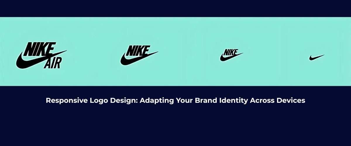
3. Create Multiple Logo Versions
For responsive logo design, a one-size-fit-all approach isn’t gonna work. Rather then just create multiple logo versions that can adjust to different screens:
- Full Logo: Icon, text or slogan—all elements can be included in a full logo. It’s ideal for larger screens like desktop monitors.
- Simplified Logo: This version might remove text or include a more minimalistic design. It’s ideal for tablet screens or medium-sized displays.
- Icon-Only Logo: Mostly icons-only logos are used for mobile screens for cleaner, efficient or compact designs.
The visual integrity of the logo can be maintained by providing multiple versions.
4. Optimize for Different Screen Orientations
It’s not just about different screen sizes—device orientations also play a role in how your logo appears. A logo that works well in landscape mode might need adjustments for portrait mode. Consider the following:
- Horizontal Logos: These logos might look great on desktop screens but could be too wide for mobile devices.
- Vertical or Stacked Logos: Vertically aligned text, icon or slogan—its an ideal logo for smaller screens like mobile.
Tips for Testing and Refining Your Responsive Logo
1. Test Across Devices
Before use, test first. The logo has been created, now it’s time to test it across all screen sizes. The electronics are smartphones, laptops, desktop or tablets. Testing on real-devices is necessary as emulators might not detect nuances.
- Check if the logo remains legible on small screens.
- Ensure that the logo’s file size is optimized for quick loading without sacrificing image quality.
- Test for color contrast to ensure visibility across device types.
2. Maintain Brand Consistency
The interactive branding requires consistency. The logo’s color scheme, font style & iconography—the change in them results in inconsistency. Responsive logo is all about making sure that each version stays consistent to your brand identity.
3. Consider User Experience (UX)
Having a responsive logo improves user experience (UX). A clean and professional logo on all screens helps build trust with your audience. An aesthetic logo also created in such a way that should fit into overall design.

Conclusion:
In short, the digital interaction, with the rise in technology also changes & having a responsive logo design can make a satisfied impression on the customer’s mind. Adapting to multiple screen sizes, resolutions or orientations — These factors can impact your brand’s versatility.
Moreover, an adaptable logo design is a perfect element for your product marketing and for dynamic branding. Testing your adaptive logo results in flexible branding.
So, design a responsive logo and be adaptable.
[…] like the crucial impact of responsive logos for every brand perception and recognition, having responsive graphics are also crucial as they can […]