


Color Psychology and Aesthetics in Web Design 2025
Boosted Build
What’s the color of your brand says about it or what’s the vibe it’s emitting? Understanding color psychology helps you to shape your brand according to what users perceive, how they interact and what they feel about your website.
So in this blog we are going to explore how color theory actually works and how it can make an impact on your website design and layouts in 2025 moreover how you can assume your brand using and understanding color theory.
Understanding the Role of Color in Web Design
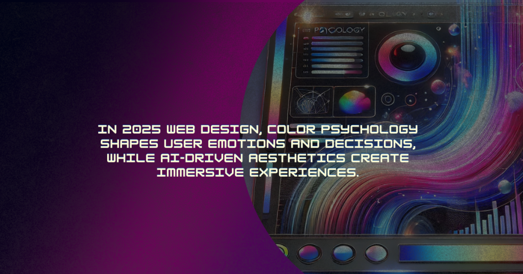
We can assume that color is a powerful tool in web design because it impacts how visitors interact with the website and craft their first impressions. The very first emotional response created by a color theory can impact a user’s decision behavior like when they decide to make a purchase, sign up for a newsletter or to subscribe to something. Colors not only design the vibe of your site also convey hidden and subtle messages about the brand identity and recognition.
Let’s explore some key ways color theory is being utilized to influence emotions and actions.
The Emotional Impact of Colors in 2025 Web Design
Each color has a psychological impact, and its effect can vary depending on the context and the user’s cultural background. Here’s how common colors are being used in 2025 to evoke specific emotions:
1. Blue – Trust and Professionalism:
Blue works for the brand who wants to win user’s trust, and wants to convey stability & professionalism. It’s a color that appeals to a broad audience. It is commonly used by financial institutions like schools, healthcare providers like hospitals and tech companies like meta support.
In 2025, usually softer shades of blues are being used by web designers like pastel blues or sky blue. This color creates a relaxing and welcoming atmosphere, while developing a sense of trustworthiness.
2. Red – Energy and Urgency
An attention grabbing color—Red, which often resembles passion, excitement and urgency. In 2025, this color is commonly used for enhancing call-to-actions (CTAs) or for limited time offers.
The color gives the vibe of urgency—making users take action quickly. Moreover the strategic use of this color makes sure that it doesn’t overload a design layout. Instead it highlights important areas, such as for highlighting text “Buy Now” or “Sign up” buttons. We can call this color “design for impact” color.
3. Green – Nature and Growth
To represent calming nature, growth, success or fitness/health—try to do color branding with “Green”. As in 2025 it’s being used to promote the emotions of calmness, renewal or success.
Designers are associating the brand content with earthy greens for a more natural and organic look to attract more eco-conscious consumers.
4. Yellow – Optimism and Attention
The color yellow delivers emotions of happiness, excitement, optimism, and innovation. Designers use it to highlight important elements, creating a warm and optimistic feel.
However, its overuse can be disturbing. So it’s recommended to use it strategically without causing visual fatigue.
5. Purple – Luxury and Creativity
The most luxurious and elegant vibe can be created by purple color. In 2025, luxury or high end brands are considering rich purple hues—to ensure exclusivity and sophistication.
Moreover, industries like fashion designing & entertainment are harnessing this shade to provide more artistic and innovative expressions.
6. Black and White – Elegance and Simplicity
The black and white themes offer a minimalist vibe, that’s thriving more in 2025. This color scheme will remain as a go-to choice for developing a more sleek, modern, timeless and sophisticated vibe.
As black enhances elegance & white shouts balance and simplicity. Collectively, this color palette can give a high-contrast aesthetic that provides both features of visually enhancing and simplifies navigation.
Creating the Right Atmosphere Through Color
Colors create the vibe and atmosphere. You control how to use and implement color psychology to inspire, relax, motivate, or excite your users with the right color schemes.
- Calming Atmosphere: Muted neutrals, soft blues or greens, these shades can create a calm and tension-free environment. These colors are perfect for sites with niche health, meditation or hospitality fields.
- Energetic and Inviting Atmosphere: An energetic vibe can be passed, if you’re using red, orange or yellow shades. This color palette will be optimal for brands and industries like entertainment, sports or travel.
- Luxurious and Exclusive Atmosphere: For a luxury brand using deep purples, blacks and golds will be optimistic. These shades create a sense of luxury and exclusivity, by which users can feel superior.
The Future of Color in Web Design
If you want to create a successful, reliable and efficient brand, start focusing more on color psychology in your website design as it will continue to grow in 2025. With technical and latest design tools and technologies web designers can have more efficient opportunities to experiment with interactive and dynamic layouts and color schemes.
Designers will create a more personalized and colorful future by tailoring web design to user preferences and behaviors, enhancing the user experience.
Conclusion
At last, color psychology means a crucial step for a website design that actually conveys a message. Colors are more than a simple aesthetic as they play a vital role in crafting your brand’s identity. Colors can talk in the hidden language of emotions that influence users navigation and decision behavior.
By deeply understanding the psychology of colors you can not only create compelling web design but also have a design that represents your brand identity and its Moto.
So understand the psychology, start crafting and make an impact on users behavior.