


Accessible Web Design-For Readability
Boosted Build
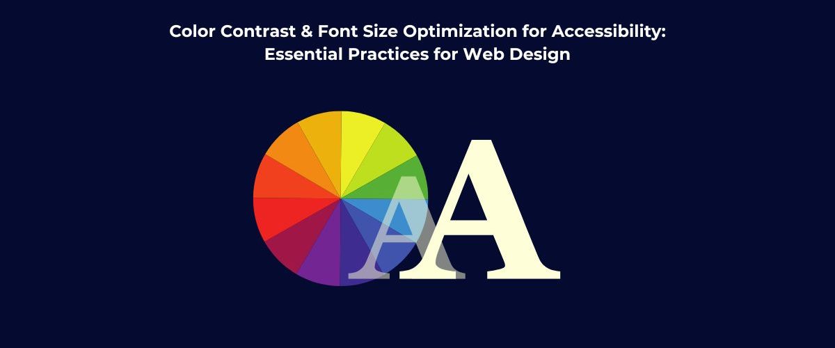
Accessible Web Design: Prioritizing Readability for All
In the fast-changing digital world, web accessibility has become a crucial part in web development. Every website can ideally be read, comprehended, and interacted with more easily by everyone when their content can be accessed by persons with different abilities across various devices which results in an accessible web design. Color contrast and font size are two; much-neglected yet significant essentials for accessible web designing.
While seemingly insignificant in the big picture, these two will mean a world of difference to the users of your site, especially to those considered visually impaired. Whoever thought that things like low vision, color blindness, or just aging eyes would find it difficult to even consume your content? Well, poor color contrast and unreadable font sizes will easily make such a challenge.
Why Color Contrast Is Essential?
Color contrast relates to how much difference is there visually in the text and background. When its contrast is not so strong, through which, visually impaired people would not be able to easily read the content which results in a very poor experience and readability.
Who Does This Impact?
- People with low vision: The individuals who are visually impaired require high contrast to read clearly.
- Color-blind users—especially the red-green blind ones, can’t differentiate between many combinations of colors.
- Older users often lose contrast sensitivity over time, making even average contrast levels challenging.
WCAG Guidelines:
According to the Web Content Accessibility Guidelines (WCAG):
- Normal-sized text should have a minimum contrast ratio of 4.5:1.
- Large text (18pt or 14pt bold) requires a minimum of 3:1.
These ratios help ensure that your text is readable under various visual conditions.
How to Improve Color Contrast?
- Choose high-contrast color pairs like black on white or white on navy.
- Avoid using color alone to show meaning. For example, red text should be paired with an icon or label, not just red text.
- Use contrast checker tools: Test every color combination with a contrast-checking tool, such as WebAIM’s Contrast Checker, to see if they pass the ideal contrast requirements.
- Offer contrast settings Provide different contrast themes such as dark mode or high contrast, thus letting users control their overall experience.
The Importance of Font Size:
Readability is majorly affected by font size. A small-sized or inconsistent font makes it difficult to read, especially users on mobile devices and those having vision disabilities.
Why It Matters
- Small text causes eye strain and discomfort.
- Some users zoom in manually, which can break your layout if it’s not designed responsively.
- Accessible font sizing reduces the need for assistive technologies like screen magnifiers.
WCAG Guidelines:
Minimum text font size is not defined in WCAG guidelines. But it is advisable to resize the text up to the level of 200% without losing any content or function. This ensures flexibility for users who need larger text.
Tips for Font Size Optimization
- Set a base font size of at least 16px for body text.
- Use relative units like em or rem instead of fixed pixels. This allows users to scale text easily.
- Make your design responsive, so font sizes adjust naturally across different devices.
- Offer text resizing tools—like zoom buttons or font size sliders.
- Keep line spacing comfortable: 1.5x the font size is usually ideal. Also, limit line length to 50–75 characters per line for easier reading.
Combine Both for Full Accessibility
Color contrast and font size should work together. A website with large fonts but low contrast isn’t accessible—and vice versa.
What You Can Do
- Test on real devices to see how text appears across different screen sizes.
- Avoid overly bright colors or very bold fonts that may overwhelm users.
- Make sure all users—regardless of ability—can read without zooming or adjusting settings manually

Conclusion:
The optimization of color contrast and font size isn’t just about compliance with the regulations; it is about making accessible web design for all users. Good contrast, suitable color combinations, and appropriately sized font types enhance the users’ experience, not just those with impairment, but all users. Thus, it’s a win-win: healthier content consumption equals bigger audience.
Accessibility is not a series of rectifications but rather a constant commitment to ensuring that the digital space is enjoyable for everyone. Start with working on color contrast and font sizes; that is a mighty step toward accessibility.