


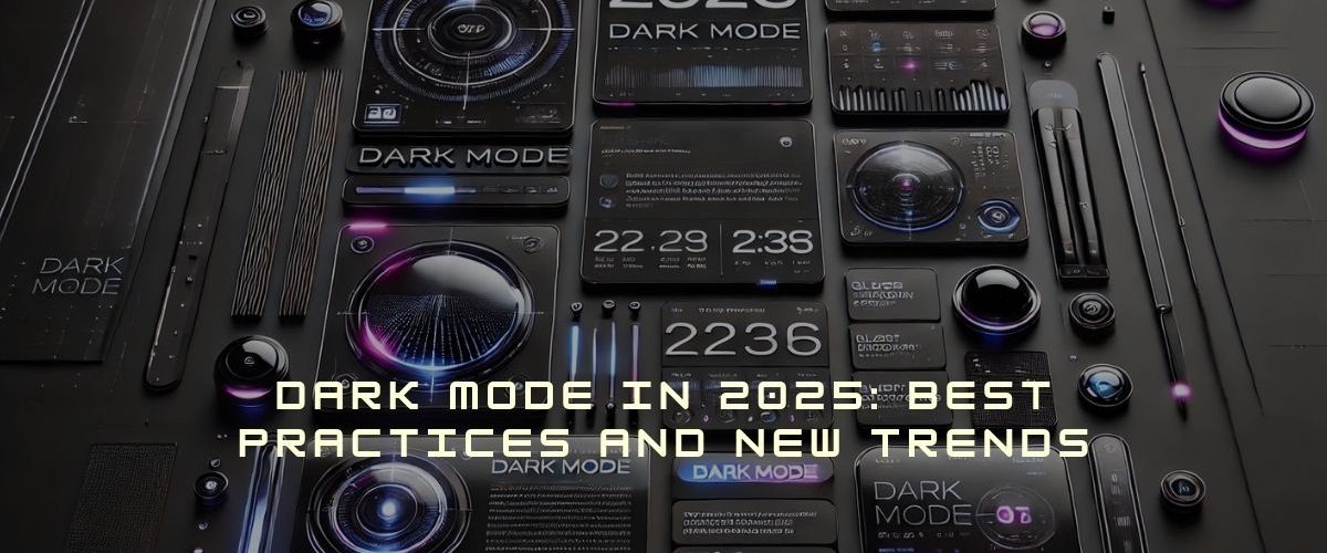
Dark Mode-Design Trend for 2025
Boosted Build
Dark mode has been evident around the world for a long period of time, but did you notice that lately, it has rapidly become the favorite option for countless people? People have been switching on their phones late at night or working for many hours on their laptops, and believe me, it helps. Formerly considered a niche feature, dark mode is now a new standard in web design and application development, and this is only going to get bigger by 2025. So, let’s talk about what makes this mode such a trend, what issues designers face, and how to bring such an experience to the user base.
Why is Dark Mode Popular?
Simply put, dark mode reverses the normal light background with dark text and makes a dark background with light text. But why are people obsessed with it?
First, it is about user comfort. Have you ever worked with a bright screen in a dark room and felt the strain on your eyes? Dark mode excels here-literally. The darker background reduces glare, which allows for better focus whereas.
Another big reason is battery efficiency. Consider using it on an OLED or AMOLED screen device; the mode is known for saving power. Unlike LCDs that consume power while displaying black, an OLED display using dark pixels will consume no power while displaying blacks. Hence, dark mode would save water and prolong the battery life, especially in mobile devices.
How Dark Mode Enhances Accessibility and User Comfort?
For many users, dark mode isn’t just about style—it’s about usability.
- Reducing eye strain: The darker background perfectly reduces the harsh light exposure to make reading comfortable for longer stretches.
- Helping those with dyslexia: Some prefer reading white text on a dark background for less visual crowding.
- Minimizing blue light exposure: Surely all would have heard the bad effects of excessive blue lighting on sleep, and dark mode is not the completely blue light-free solution, since it does reduce overall brightness making it a good option for reading around bedtime.
All dark modes do vary in quality. Just flipping the colors won’t work; the contrast, text legibility, and overall user experience should still be top-notch in everything.
Design Challenges in Dark Mode
In spite of the multiple advantages of dark mode, designing an effective night mode experience does not simply boil down to color inversion. There are several fundamental challenges that designers need to tackle with:
1. Contrast Enhancement
One of the biggest issues with this mode is poor contrast. Legibility can be easily compromised if the text is too light or too dark against the backdrop. In most cases, people tend to use pure black and pure white as text and background colors in deals. However, that is an absolute high contrast that will indeed cause fatigue to the human eye. Slightly off-whites, grays, and other shades of white are better options to take strain off the reader’s eyes.
2. Readability
Writing text in night mode can pose reading challenges if the letters are too small or poorly spaced. Fonts that appear thin or condensed may just be hard to differentiate under low-light conditions. Appropriate solutions would be using larger font sizes, wider line-spaced, and proper margins.
3. Psychological Effects
Dark mode can change how users perceive content. Some suggest using dark mode sparingly on text-heavy sites like YouTube and Spotify. Since people are used to reading dark text on a light background, this mode isn’t ideal for long reading. That’s why users should have the option to switch between light and dark modes.
Best Practices for Dark Mode in 2025
1. Offer an Easy Toggle design option
Users should have an easy option to switch between dark and light modes. This toggle should be located in an easy-to-access place, whether within an app’s settings or in system-wide settings. Presently, many platforms afford users the luxury of turning on dark mode, either scheduled throughout the day or based on system settings, thus increasing user comfort.
2. Prioritize Contrast
In other words, an arrangement of colors with extreme contrast should be used that preserves the readability of the presentation. These letters and colors should have specified contrast ratios in the Web Content Accessibility Guidelines (WCAG), thus ensuring that this mode designs appeal to beauty and accessibility.
3. Use Subtle Accent Colors
While dark mode often relies on muted color schemes, it’s essential to use accent colors to guide users’ attention. Soft colors should be applied against dark backgrounds to provide some contrast without being too harsh. For example, CTAs and links can be highlighted in soft shades of bluish tones or greenish hues, which stand out well but do not make the overall design look very flashy.
4. Test Across Multiple Devices
Dark mode may appear differently across devices, from smartphones to desktop monitors. Testing the night mode designs on various devices is mandated to ensure that users have a consistent, pleasing experience on any digital device. Dark mode needs to look good on every screen for a high-quality user experience.

Conclusion:
Indeed, dark mode is much more than a trend in design; it has constantly been providing improved user comfort, accessibility, and energy efficiency. Entering 2025, there is little doubt that dark mode will continue to gain prominence as an integral design component for web and application user interfaces.
Knowing about dark mode’s challenges and best practices is essential for designers who want to create an interface that is not just eye candy but also meaningful for accessibility and usability. As dim mode is widely adopted across platforms, those who observe the best practices will set the trend for future digital design.
Not just for style try night mode in your apps for Eyes Protection!