Responsive Design: Its Importance in 2024

Responsive Design in 2024: Still Relevant? Absolutely Essential.
In a mobile district of our culture today even though we are tall the most important question is how best we can employ this tool (responsiveness).
At Boosted Build, we pride ourselves in understanding that our world is constantly changing digitally. The long-lasting relevance of responsive design in 2024 will be assessed in this blog post, with particular attention on its benefits for both businesses and consumers.
A World of Screens: Catering to the Multi-Device User Journey
One thing for sure is that accessing information has changed completely. People go online using desktop computers, laptops, tablets and smartphones as well. As a result of responsiveness our websites have to be compatible on all devices for these users:
Enhanced User Experience:
A website with a responsive design is user-friendly and changes with the size or resolution of your screen. No need to zoom, pinch, or scroll sideways – each of these helps improve user experience.
Improved Search Engine Optimisation (SEO):
The ranking algorithm for Google’s search engines gives preference to mobile-friendly web pages in the search results it produces. With responsive design ease-of-discovery happens any time someone searches using diverse gadgets.
Boosted Conversions and Sales:
A smooth user experience across multiple devices can lead to increased conversion rates. If browsing on their preferred gadget is so simple then potential buyers are more likely not only likely to make purchases but also subscribe to newsletters as well.
Cost-Effectiveness:
Responsive design eliminates the need to maintain separate websites for desktop and mobile users. Thereby saving developers a lot of money on both development and ongoing maintenance.
Beyond the Basics: Optimising Responsive Design for 2024
Responsive design has ceased being a mere aspect; it now demands persistent tuning. The following guide outlines steps for staying ahead of things in 2024:
Mobile-First Approach:
Focus on mobile experience while designing your site. It’s important that every essential content and functionality can be accessed from small screens
Fast Loading Speeds:
Mobile users expect websites to be loaded quickly. Optimise the images, codes and use caching techniques for smooth and responsive user experience.
Voice Search Optimisation:
Based on the voice search rise trend, optimise your website contents around natural language queries. In this way, they will be able to find the information they are looking for through voice commands on their phones
Progressive Enhancement:
Begin by designing a simple mobile version of your website before introducing more features and functionalities for bigger monitors.
Accessibility for All: Responsive Design and Inclusivity
In accord with accessibility is responsive design:
Usability for All Devices:
The website should be accessible to disabled persons who depend on assistive technologies such as screen readers, according to responsive design.
Content Hierarchy and Readability:
A responsive layout allows for prioritisation of content hierarchy while ensuring readability of text on various screen sizes
Proper Use of Alt Text:
On the other hand, proper alt text descriptions for images are essential for those users having visual impairment although responsive design does not eliminate this need.

The Future of Responsive Layout: Continuous Evolution
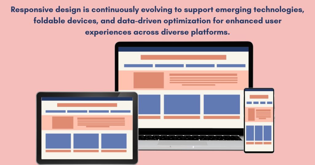
The digital world keeps changing constantly and so should responsive designs adapt:
Emerging Technologies:
Emerging technologies like AR and VR require that the web space grows out toward their support across many devices, thus calling for an evolution in the practice of responsive layout.
Foldable Devices:
Foldable devices present both new opportunities and challenges to responsive designs; sites will have to adjust themselves in order to provide better viewing experiences on these systems with different screen sizes and patterns at any time.
Data-Driven Optimisation:
User data analytics will play an even greater role in optimising responsive designs going forward.The location of viewing sessions using A/B testing or heat maps would help assess patterns of behaviour by users through various tools hence facilitating ongoing improvement in design.
Conclusion: Responsive Design – A Foundation for Success
Responsive web design won’t be optional after 2024. At Boosted Build we have recognized that, hence our team comprises experts who are capable of designing websites with responsive features that serve the needs of specific people, engage users optimally and enable companies to thrive in the digital landscape that keeps changing. Get in touch with us today; let’s build a website that can be viewed beautifully on all devices.


[…] well structured responsive design needs well organized responsive graphics and it’s like adding cherry on the top of cake. […]