


Adaptive and Responsive Web Design
Boosted Build
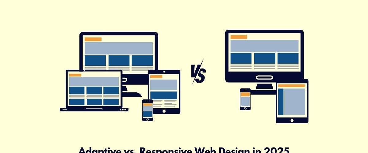
The need for a truly effective and user-friendly web design becomes particularly paramount in 2025 when mobile traffic keeps rising and web users access contents across devices. The two of the much modern approaches to web design are adaptive and responsive designs. However, how do they compare, and what’s the best option for your website? This blog actually discusses the real difference between adaptive and responsive web design and expresses some views about which one would suit your needs concerning the use of a website in 2025.
What is Responsive Web Design?
Responsive web design is said to be the design of a website that accommodates all possible size screens, from the big size computer screens to a small screen of a mobile device. This comprises its flexible grids, fluid images, and CSS media queries to provide a device-wise better view of a web page.
Key Features of Responsive Design:
- Fluid Grid System: Use percentages rather than fixed pixel widths, so the content will also resize according to this proportional resizing.
- Media Queries: CSS techniques that will manage layout according to properties defined by the devices as width, height, and resolution.
- Flexible Images: Images resize according to the screen size without breaking the layout.
What is Adaptive Web Design?
Adaptive web design uses predetermined layouts that adjust themselves fittingly to various screen sizes. Instead of resizing contents, adaptive design detects a user’s device and this device detection provides the most suitable layout for that screen. This is considered relatively more tailor-made because it serves personalized layouts according to different device categories, such as mobile, tablet, or desktop.
Key Features of Adaptive Design:
- Predefined Layouts: Multiple layouts are designed for different screen widths or device categories.
- Device Detection: The site detects the device type and serves an optimized layout based on it.
- Customization: Offers more control over the user interface (UI) and user experience (UX) for specific devices.
Core Differences Between Adaptive and Responsive Web Design
| Feature | Responsive Web Design | Adaptive Web Design |
| Layout Flexibility | Fluid layout adjusts dynamically to different screen sizes | Fixed layouts for specific screen sizes or devices |
| Complexity | Simplified, uses a single layout for all devices | More complex with multiple layouts for different devices |
| Customization | Limited, as it relies on scaling existing elements | High customization with tailored layouts for each device |
| Load Speed | Can be slower on mobile devices due to loading larger assets | Faster load times as only the necessary layout and content are loaded |
| SEO Performance | Consistent SEO performance across all devices | Can be SEO-friendly, but requires more management for each layout |
| Maintenance | Easier to maintain with a single codebase | Can be more difficult to maintain due to multiple layouts |
When to Choose Responsive Web Design in 2025
Responsive design is likely the solution for nearly all sites by 2025, especially with designs oriented towards simplicity and flexibility. Here are the scenarios where responsive web design applies best:
1. Web design for a Diverse Audience
Because of the many different formats available, responsive design is probably one of the best designs because it can be made available on various devices. Thus, it enables a very smooth experience across all of the devices, including mobile devices, tablets, and desktop devices.
2. Content-Heavy Websites
Sites such as blogs, news sites, etc., are well-suited for responsive designs. The flexibility of the design allows users to comfortably read and engage with content either on a mobile phone or a desktop.
3. SEO Considerations
Google affirms responsive web design, around mean simplicity from an indexing perspective. Actually, this is very important for search engine optimization in 2025. Unified URLs ensure better search engine visibility.
4. Cost-Effective Development
With one codebase for all screen sizes, responsive design tends to be more cost-effective for businesses looking to minimize development and maintenance costs.
When to Choose Adaptive Web Design in 2025
Responsive design is versatile, but there are occasions that call for the use of adaptive web design. Here are some cases where AWD stands out:
1. Highly Customized User Experiences
The adaptive design features content, images, and layouts tailored for each device and is perfect for eCommerce and gaming sites.
2. Performance-Driven Websites
Loading content only when necessary, adaptive design speeds up the site on mobile and slower networks to retain more users.
3. Complex Layouts or Functionality
It gives a consistent interactive experience and forbids design problems across varying screen sizes, which is perfect for rich graphics and complex sites.
4. Targeting Specific Devices
If your audience prefers a particular device, then adaptive design optimizes for a seamless browsing experience.
Key Considerations for 2025
- Mobile-First Design: Apparently, mobile has taken the center stage. Therefore, a mobile-accessible site is indispensable. Adaptive and responsive designs comply with this requirement, but responsive design guarantees much larger compatibility.
- Progressive Web Apps (PWAs): As their core, PWAs make responsive applications appropriate for comfort performance with offline possibilities alongside swift load on any device.
- User Experience (UX): In the first place, both have an impact on overall experience, but adaptive design takes precedence in this case, leveraging Javascript optimization for devices that requires a high degree of optimization for devices-gaming or interactive apps.
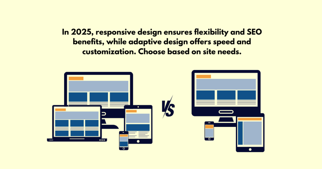
Conclusion: Which Approach Should You Choose?
Choosing between adaptive and responsive web design in the year 2025 will really depend on what your site needs from it.
However, go with Responsive Design for all those flexible, budget-friendly, and SEO-friendly sites, which work on every device.
Adaptive will work for device-specific experiences, better performance, and particular devices.
Responsive design is the long-term choice for most, but adaptive offers much better control and speed. Make a decision according to your target audience, contents, and design goals.