


Performance Web Design in 2025
Boosted Build
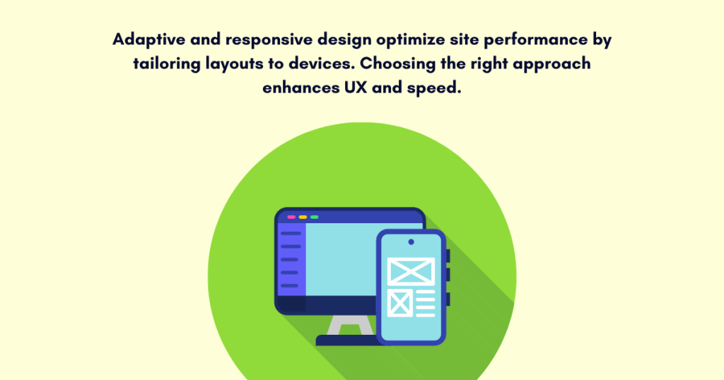
You’ve created a website for your business, In 2025, performance web design is more critical than ever. You’ve created a website, optimized for SEO and user experience, but are you focusing on optimal performance or do you know why and where to use adaptive or responsive design?
Well these two design layouts i.e. Adaptive or Responsive are layouts on which mostly sites are being designed based on their needs, preference and their uses. To overcome any compromises during user engagement these two strategies are mostly in sight. So, In this blog, we’ll discuss Why, Where and How to prefer these layout designs? What are their pros and cons? How can these provide optimal performance to your site? Let’s skim below:
Understanding Adaptive and Responsive Design
Responsive Design
A most strategic approach to web layout designing, where the site’s layout adapt and adjust itself according to user’s screen size—Responsive Design
This type of web layout can be achieved by the use of CSS media queries. This basically alerts the design layout based on viewport dimensions. Responsive web design layout makes sure that content is easily accessible and legible on multiple screen sizes, providing enhanced desktop design or smartphone designs.
Adaptive Design
The web design layout that delivers different layouts based on the user’s device type—Adaptive Design.
It provides tailored web layout based on detected device and adjusts itself according to device, unlike responsive website design. These versions are specifically designed to offer adaptive content for devices like desktops, mobile devices & tablets.
Key Performance Optimization Techniques for 2025
When aiming for performance web design, it’s crucial to apply effective strategies—whether you use adaptive or responsive layouts. While discussing optimal performance—it’s crucial for every type of layout design whether it’s responsive or adaptive design. So below we’re going to state some successful technique to implement for optimal performance in 2025:
Optimizing Responsive Design Performance
Website responsiveness means, site must be efficient across all devices. So here are some best practices you can use for optimal performance:
1. Mobile-First Design
Most used devices are MOBILES.
So mobile-first design should be your first priority. Mobile-first design optimization means most users can easily access your content and can get a seamless experience. By using small size images and refining CSS before optimizing for larger screens can be a best practice.
2. Use of Flexible Layouts
The use of a flexible grid can enhance the reliance of responsive design on flexible layouts. By doing so, it can resize the content based on the viewport providing smooth performance without the effect of screen size.
3. Minimizing CSS and JavaScript Files
Javascript Optimization and optimizing unnecessary CSS files can enhance site performance speed. Minimize, compress, and combine these files to reduce the overall page load time. Tools like Webpack or Gulp can be used to automate these processes.
4. Image Optimization
Responsive sites can be bogged down by large image files. To optimize images:
- Use image formats like WebP for smaller file sizes.
- Implement lazy loading to only load images when they enter the viewport.
- Use the srcset attribute to serve images in different resolutions based on device capabilities.
5. Avoid Overuse of Media Queries
Too many media queries can degrade performance. Limit their use by focusing only on essential adjustments for different viewports, reducing unnecessary CSS changes.
6. Feature of Server-Side Rendering (SSR)
By pre-rendering content on the server, SSR optimizes and enhances responsive designs. This also improves loading time and provides content efficiently to users, causing optimized performance.
Optimizing Adaptive Design Performance
When using adaptive layout, your performance optimization must focus on loading the right version of your site efficiently & below are some practices you can use:
1. Device Detection with Minimal Latency
Adaptive design relies on detecting device types before serving content. Use lightweight server-side or client-side detection to ensure fast, low-latency delivery of the best user experience.
2. Serve Optimized Content
Each version of the adaptive design should be optimized for the device it’s intended for. For example:
- For mobile devices, serve images in smaller resolutions and use touch-friendly interfaces.
- For desktop versions, include higher-resolution images and content that takes advantage of larger screens.
Serving the appropriate version ensures quicker loading times and reduces unnecessary data usage.
3. Minimize Redundant Content
Remove unnecessary content for specific devices, such as mobile navigation on desktops or large images on mobile, to reduce load times and improve efficiency.
4. Optimize API Calls
Use lightweight APIs that return only essential data for each device, minimizing payload size and unnecessary requests to boost performance.
5. Prioritize Mobile Performance
Focus on optimizing mobile content first, ensuring fast load times with compressed images, optimized CSS, and JavaScript to prevent user abandonment.
6. Cache Static Assets
Implement caching strategies, like HTTP headers and service workers, to store static assets and speed up loading for returning users, especially on mobile networks.
When to Use Adaptive vs. Responsive Design
While choosing, which layout design should you use? First completely understand your website or audience requirements. So below are some situations you must considered:
Use Responsive Design When:
- When you prefer unified web design for all devices, providing a consistent experience on all screen sizes.
- Without considering device-specific content, your site needs to cater to a large variety of devices.
- When your audience frequently shifts devices & prefer seamless experience.
Use Adaptive Design When:
- When you want to deliver more device-specific content, refining user experience based on device capabilities.
- When you need more control over performance on multiple devices, mainly for sites with complex media like images or videos.
- Your targeted audience mainly uses specific devices (e.g., mobile-first or desktop-first).
Conclusion:
Ultimately, mastering performance web design means knowing when and how to use adaptive or responsive layouts for your audience. We’ve come to know that both approaches provide optimal performance but optimizing for target audience and for detected devices will provide you efficient results.
Although we know optimal performance web design can be done by using the right layout, multiple factors can make better effects like minimizing file sizes, using compressed images & providing personalized content for seamless user experience.
So Understand Layout, Implement it & Be Efficient!