


UX Optimization Tips for Better Conversions
Boosted Build

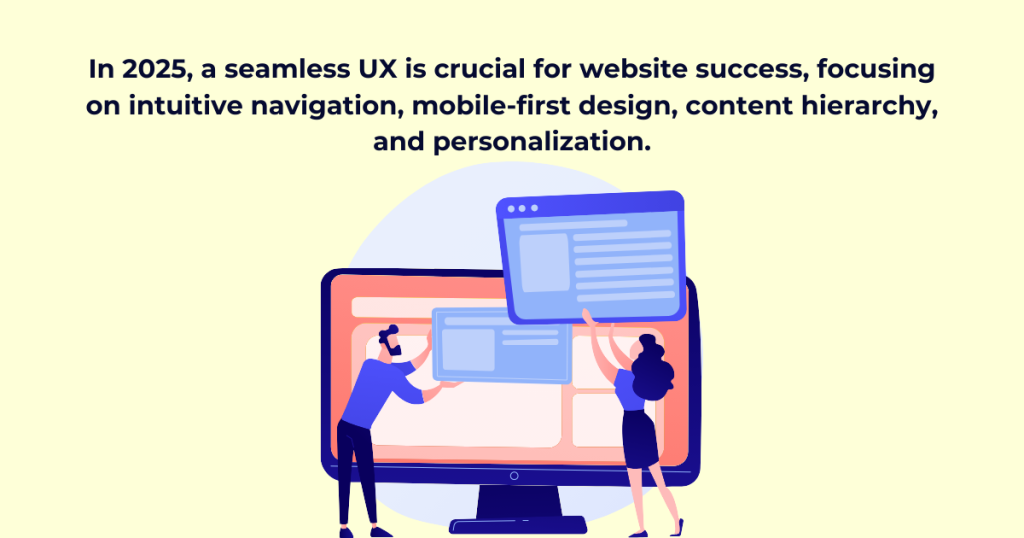
In 2025, simply creating an attractive website is not enough to make the company stand out; it requires a seamless user experience (UX) optimization with all the variables reliant on visitor engagement and conversion rates. It is not just the influence of mobile usage; AI personalization and now potentially the influence of induced expectations by users are putting even greater pressure on the need for user experience.
Today’s users want speed, clarity and easy navigation; they simply cannot wait for long loading times, confused layouts, or irrelevant information. If they can’t find what they’re looking for, they’re out of the site in a matter of seconds. Search engines such as Google, for instance, are making it evident because they’re rewarding websites with better rankings if they present smooth, user-friendly experiences.
So what does it take to create a site that will keep users engaged and drive results? Beginning with a complete deep understanding of user behavior, strategic design decisions, and continuous optimization of this. The success of creating an effective website-from a full redesign to a ground-up site build-is usability, accessibility, and efficiency. This requires UX optimization, where every element is refined to enhance user satisfaction and engagement. This guide will address fundamental UX principles, pragmatic strategies, and best practices for creating a user-centered website that is both exceptionally modern and of real value.
Why Website Structure Matters
More than aesthetics, this design will impart a more consistent and better flow on your website. UX optimization plays a key role here—navigation and an effective website can lead to better conversion rates. Indeed, a confusing, clunky layout frustrates users, as well as making them hungry to leave the site in search of something else. Utilized properly, a streamlined approach creates effortless browsing and even increases the overall engagement of visitors all the way through to the action point.
Key Elements of a User-Centric Website
1. Know Your Users: Personas & Behavior Analysis
A website should start by knowing who their audience is. It is only through data-driven strategies that businesses measure user behavioral trends-and then scaffold their website in such a manner as to make way for richer presentations of people’s more relevant experiences.
Why It Matters:
- Sharpens content and design strategies.
- Anticipates user needs, reducing friction.
- Enhances navigation and engagement.
How to Gather Data:
- Leverage Google Analytics, heatmaps, and session recordings.
- Collect feedback via surveys and social media interactions.
- Refine personas continuously as user behavior evolves.
2. Simplify Navigation: Make It Intuitive
Navigation is the backbone of user experience. Visitors who cannot find what they need are not likely to stick around. Implement sticky navigation, in order to retain visibility of menus as the users scroll, in order to have uninterrupted access to the most significant pages at any time.
Best Practices:
- Keep It Simple: Limit menu items and use clear, concise labels.
- Prioritize Key Pages: Feature important sections prominently.
- Sticky Navigation: Keep menus accessible at all times.
- Breadcrumbs: Help users track their location on the site.
💡 Fact: A user can form a judgment of whether or not to stay on a website within a time frame of 10 seconds. A clean and intuitive design keeps the user interested.
3. Master Content Hierarchy: Organize for Readability
A content hierarchy well structured will allow users to find information quickly and thus improve the overall user experience and SEO.
Best Practices:
- Use Clear Headings: Break content into digestible sections (H1, H2, H3).
- Group Similar Content: Logical categorization simplifies navigation.
- Add a Search Function: Helps users locate specific content instantly.
- Optimize for Mobile: Ensure content adapts seamlessly across screens.
💡 Fact: 68% of visitors leave a site if they can’t find what they need fast.
4. Prioritize Mobile-First Design
Mobile browsing dominates, so your site must be optimized for smartphones and tablets first.
Key Mobile Strategies:
- Simplified Menus: Use collapsible or hamburger icons.
- Touch-Friendly Design: Ensure buttons are large and easy to click.
- Faster Load Times: Speed is crucial—slow sites lose visitors.
💡 Fact: 53% of mobile users abandon a site if it takes longer than 3 seconds to load.
5. Personalization & User Journey Mapping
Users expect tailored experiences. A static website won’t cut it in 2025—customization is key.
How to Personalize:
- Behavioral Targeting: Show relevant content based on browsing history.
- Dynamic Content: Adjust images, text, and layouts based on user preferences.
- Smart CTAs: Customize calls to action (e.g., “Start Free Trial” vs. “Learn More”).
💡 Fact: Companies that implement effective personalization can boost revenue by 15% or more (McKinsey).
Final Thoughts
User-focused sites go much beyond aesthetically pleasing sites made only for show, instead focusing on UX optimization—ensuring pure function, flow, and meaningful interaction. By understanding the audience, an easy experience should be created with easy navigation, a properly organized content structure, and an emphasis on mobile usability. That experience will entice visitors back. Personalization adds an extra layer, creating the feeling that the site was really designed for them. The businesses that center their operations on the users will be the front-runners come 2025. Design your site with them in mind, and watch positive momentum build.